Designing Beyond the Generic AI Aesthetic
Most AI landing pages look exactly the same—rounded corners, soft gradients, and the same generic illustrations. Every time I browse a new tool, I see the same SaaS blue palette and friendly but forgettable visuals. It feels like we're losing the edge that high performance engineering tools used to have.
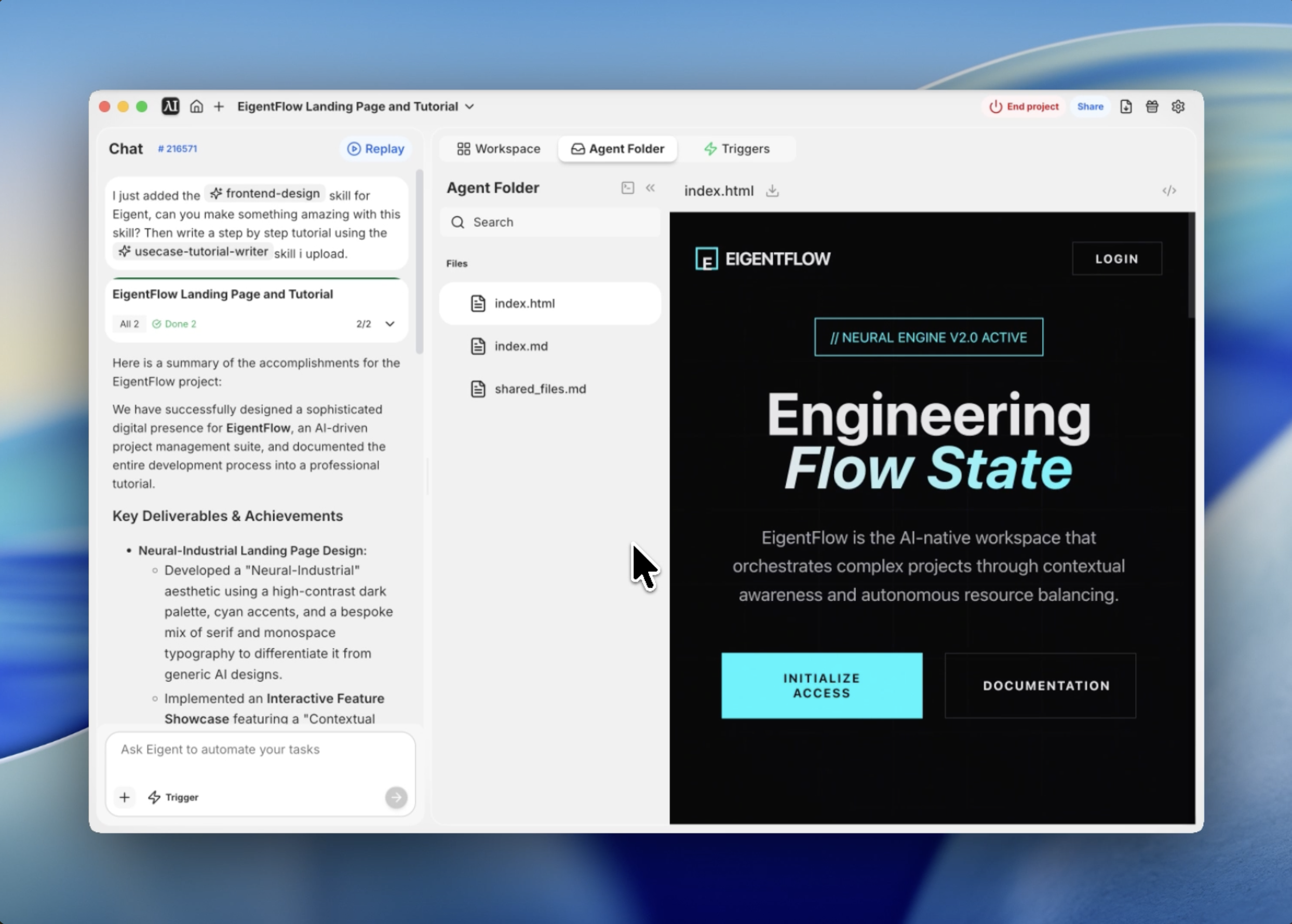
When I set out to build the interface for EigentFlow—a fictional AI-driven project management suite—I wanted something different. I wanted it to feel like a high end IDE or a terminal based command center, but with the polish of a modern web experience. I call this aesthetic Neural Industrial.
I used Eigent's frontend design skill to bridge the gap between this abstract design philosophy and a production ready implementation. Here's how I built it.
Defining the Visual Identity
The first step was setting the constraints for the design system. I didn't want a generic light mode; I wanted a deep, obsidian black background with high contrast cyan accents that felt like glowing circuitry.
I started by defining a CSS variable system that would drive the entire project. We settled on a dark palette (#0A0A0B) and a vibrant "Neural Cyan" (#00F5FF). For typography, I mixed a serif font for headlines to give it an elite, editorial feel, with a monospace font for technical details.
Prompting the Agent
Instead of writing the boilerplate myself, I gave Eigent a highly specific prompt that included the design philosophy and the required interactive modules.
Use the frontend design skill to design and build a production grade landing page for EigentFlow. Use a Neural Industrial theme with a dark palette, cyan accents, and a blend of Playfair Display and JetBrains Mono fonts. Include an interactive showcase module where users can manipulate Contextual Density.
Eigent immediately began architecting the structure, prioritizing a single file approach to ensure the entire experience was self contained and easy to deploy.
Creating Depth with Texture
A major problem with dark mode designs is that they can feel flat. To solve this, I had Eigent implement a grain overlay and a radial grid background.
The grain overlay is a SVG noise texture pinned to the viewport with a low opacity—it gives the screen a physical, tactile quality. Underneath, a dynamic grid background is masked by a radial gradient, so the lines fade out toward the edges of the screen, drawing the user's eye toward the center. These subtle touches are what separate a "template" from a custom design.
Engineering the Hero Experience
The hero section needs to do more than just show a headline; it needs to set the rhythm of the page. I used staggered scroll reveal animations to introduce the elements one by one.
Eigent wrote a custom intersection observer script in Vanilla JS to handle this. As you scroll, the "Neural Engine Status" tag appears first, followed by the italicized headline and the call to action buttons. This deliberate pacing makes the tool feel powerful and intentional rather than just a static page.
Building the Interactive Engine Showcase
The centerpiece of the landing page is the "Autonomous Task Architecture" showcase. I wanted users to be able to "interact" with the AI's internal state.
We built a module featuring a range slider labeled "Contextual Density." As the user moves the slider, the underlying JavaScript triggers visual updates: a CSS animated neural circle expands and contracts, and a simulated data stream in the background accelerates. This isn't just eye candy—it demonstrates the "fluidity" of the AI engine in a way that words can't.
Optimizing for Performance
Finally, I made sure the entire codebase was optimized. Even with the custom animations and heavy font usage, the final index.html file is lightweight and highly responsive.
By using CSS variables for all design tokens, it's incredibly easy to pivot the brand colors later. Eigent even included Lucide icons via CDN, keeping the asset footprint minimal while ensuring high quality vector visuals across all device sizes.
Why This Matters
This workflow demonstrates something fundamental about how Eigent works: the real power of AI agents isn't just generating code—it's the ability to interpret high level aesthetic directions and translate them into a coherent technical architecture.
I didn't have to specify every hex code or animation duration in the initial prompt. Because the frontend design skill understands design principles, it was able to fill in the blanks between my vision for a Neural Industrial theme and the actual CSS implementation.
What to Try Next
Create a dark themed analytics dashboard using the same Neural Industrial design system. Build a documentation page for the EigentFlow API that matches this landing page's typography and color palette. Add a 'terminal mode' toggle that replaces the serif headlines with JetBrains Mono throughout the site.
Each of these leverages the same design tokens and aesthetic logic — no additional setup required.
Tips for Better Results
- Use design focused adjectives. Words like Neural Industrial, Obsidian, or Cinematic help Eigent narrow down the aesthetic range better than nice or modern.
- Specify font pairings. If you want a specific vibe, tell Eigent which fonts to mix (e.g., Serif for headlines, Monospace for data).
- Ask for Depth specifically. If the design feels flat, ask Eigent to add grain textures, radial masks, or subtle drop shadows.
- Single file delivery. Requesting a single file solution (HTML/CSS/JS in one) makes it much easier to review and test the entire UI instantly.